Rootograms for Assessing Goodness of Fit of Probability Models
Description
Rootograms graphically compare (square roots) of empirical frequencies with expected (fitted) frequencies from a probabilistic model. If plot = TRUE, the resulting object of class “rootogram” is plotted by plot.rootogram or autoplot.rootogram before it is returned, depending on whether the package ggplot2 is loaded.
an object from which an rootogram can be extracted with procast.
…
further graphical parameters passed to the plotting function.
newdata
an optional data frame in which to look for variables with which to predict. If omitted, the original observations are used.
plot
logical or character. Should the plot or autoplot method be called to draw the computed extended reliability diagram? Logical FALSE will suppress plotting, TRUE (default) will choose the type of plot conditional if the package ggplot2 is loaded. Alternatively “base” or “ggplot2” can be specified to explicitly choose the type of plot.
class
should the invisible return value be either a data.frame or a tbl_df. Can be set to “data.frame” or “tibble” to explicitly specify the return class, or to NULL (default) in which case the return class is conditional on whether the package “tibble” is loaded.
breaks
NULL (default) or numeric vector to specifying the breaks for the rootogram intervals. A single numeric (larger than 0) specifies the number of breaks to be chosen via pretty (except for discrete distributions).
width
NULL (default) or single positive numeric. Width of the histogram bars. Will be ignored for non-discrete distributions.
style
character specifying the syle of rootogram (see ‘Details’).
scale
character specifying whether “raw” frequencies or their square roots (“sqrt”; default) should be drawn.
expected
logical or character. Should the expected (fitted) frequencies be plotted? Can be set to “both” (same as TRUE; default), “line”, “point”, or FALSE which will suppress plotting.
confint
logical, defaults to TRUE. Should confident intervals be drawn?
ref
logical, defaults to TRUE. Should a reference line be plotted?
xlab, ylab, main
graphical parameters forwarded to plot.rootogram or autoplot.rootogram.
Details
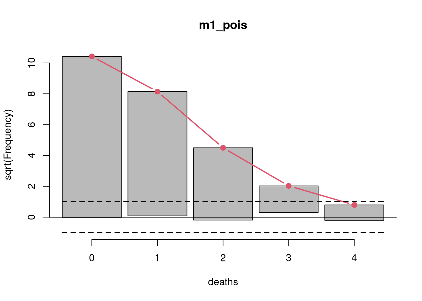
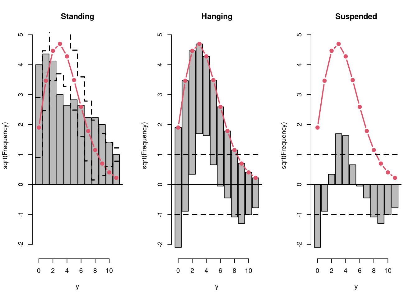
Rootograms graphically compare frequencies of empirical distributions and expected (fitted) probability models. For the observed distribution the histogram is drawn on a square root scale (hence the name) and superimposed with a line for the expected frequencies. The histogram can be “hanging” from the expected curve (default), “standing” on the (like bars in barplot), or drawn as a “suspended” histogram of deviations.
Rootograms are associated with the work of John W. Tukey (see Tukey 1977) and were originally proposed for assessing the goodness of fit of univariate distributions. See Friendly (2000) for a software implementation, in particular geared towards count data models. Kleiber and Zeileis (2016) extend it to regression models for count data, essentially by replacing the expected frequencies of a univariate distribution by the sum of the expected frequencies from the different conditional distributions for all observations.
The function rootogram leverages the procast generic in order to compute all necessary coordinates based on observed and expected (fitted) frequencies. It is thus not only applicable to count data regressions but to all (regression) models that are supported by procast.
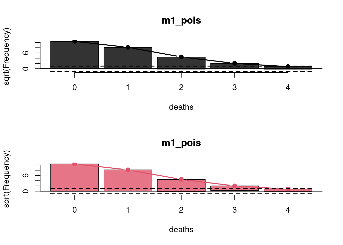
In addition to the plot and autoplot method for rootogram objects, it is also possible to combine two (or more) rootograms by c/rbind, which creates a set of rootograms that can then be plotted in one go.
Value
An object of class “rootogram” inheriting from “data.frame” or “tibble” conditional on the argument class with the following variables:
observed
observed frequencies,
expected
expected (fitted) frequencies,
mid
histogram interval midpoints on the x-axis,
width
widths of the histogram bars,
confint_lwr, confint_upr
lower and upper confidence interval bound.
Additionally, style, scale, expected, confint, ref, xlab, ylab, amd main are stored as attributes.
Note
Note that there is also a rootogram function in the vcd package that is similar to the numeric method provided here. However, it is much more limited in scope, hence a function has been created here.
References
Friendly M (2000), Visualizing Categorical Data. SAS Institute, Cary.
Kleiber C, Zeileis A (2016). “Visualizing Count Data Regressions Using Rootograms.” The American Statistician, 70(3), 296–303. doi:10.1080/00031305.2016.1173590
Tukey JW (1977). Exploratory Data Analysis. Addison-Wesley, Reading.
See Also
plot.rootogram, procast
Examples
library("topmodels")## plots and output## number of deaths by horsekicks in Prussian army (Von Bortkiewicz 1898)deaths<-rep(0:4, c(109, 65, 22, 3, 1))## fit glm modelm1_pois<-glm(deaths~1, family =poisson)rootogram(m1_pois)
## combine plotsplot(c(r1, r1), col =c(1, 2), expected_col =c(1, 2))
#-------------------------------------------------------------------------------## different styles## artificial data from negative binomial (mu = 3, theta = 2)## and Poisson (mu = 3) distributionset.seed(1090)y<-rnbinom(100, mu =3, size =2)x<-rpois(100, lambda =3)## glm method: fitted values via glm()m2_pois<-glm(y~x, family =poisson)## correctly specified Poisson model fitpar(mfrow =c(1, 3))r1<-rootogram(m2_pois, style ="standing", ylim =c(-2.2, 4.8), main ="Standing")r2<-rootogram(m2_pois, style ="hanging", ylim =c(-2.2, 4.8), main ="Hanging")r3<-rootogram(m2_pois, style ="suspended", ylim =c(-2.2, 4.8), main ="Suspended")
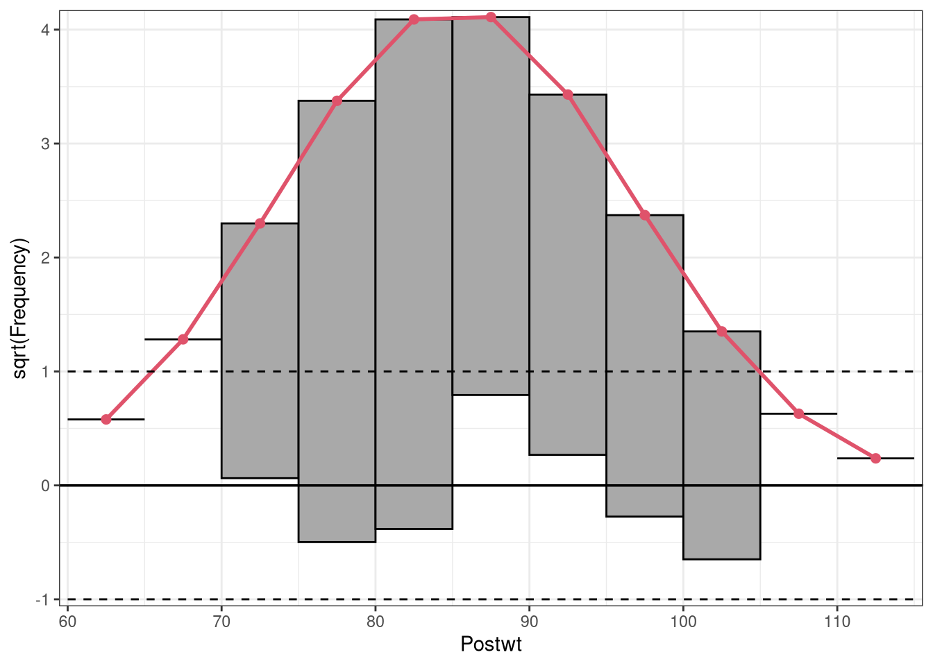
par(mfrow =c(1, 1))#-------------------------------------------------------------------------------## linear regression with normal/Gaussian response: anorexia datadata("anorexia", package ="MASS")m3_gauss<-glm(Postwt~Prewt+Treat+offset(Prewt), family =gaussian, data =anorexia)## plot rootogram as "ggplot2" graphicrootogram(m3_gauss, plot ="ggplot2")