PIT Histograms for Assessing Goodness of Fit of Probability Models
Description
Probability integral transform (PIT) histograms graphically compare empirical probabilities from fitted models with a uniform distribution. If plot = TRUE, the resulting object of class “pithist” is plotted by plot.pithist or autoplot.pithist depending on whether the package ggplot2 is loaded, before the “pithist” object is returned.
an object from which probability integral transforms can be extracted using the generic function procast.
…
further graphical parameters forwarded to the plotting functions.
newdata
an optional data frame in which to look for variables with which to predict. If omitted, the original observations are used.
plot
logical or character. Should the plot or autoplot method be called to draw the computed extended reliability diagram? Logical FALSE will suppress plotting, TRUE (default) will choose the type of plot conditional if the package ggplot2 is loaded. Alternatively “base” or “ggplot2” can be specified to explicitly choose the type of plot.
class
should the invisible return value be either a data.frame or a tbl_df. Can be set to “data.frame” or “tibble” to explicitly specify the return class, or to NULL (default) in which case the return class is conditional on whether the package “tibble” is loaded.
scale
controls the scale on which the PIT residuals are computed: on the probability scale (“uniform”; default) or on the normal scale (“normal”).
breaks
NULL (default) or numeric to manually specify the breaks for the rootogram intervals. A single numeric (larger 0) specifies the number of breaks to be automatically chosen, multiple numeric values are interpreted as manually specified breaks.
type
character. In case of discrete distributions, should an expected (non-normal) PIT histogram be computed according to Czado et al. (2009) (“expected”; default) or should the PIT be drawn randomly from the corresponding interval (“random”)?
nsim
positive integer, defaults to 1L. Only used when type = “random”; how many simulated PITs should be drawn?
delta
NULL or numeric. The minimal difference to compute the range of probabilities corresponding to each observation to get (randomized) quantile residuals. For NULL (default), the minimal observed difference in the response divided by 5e-6 is used.
simint
NULL (default) or logical. In case of discrete distributions, should the simulation (confidence) interval due to the randomization be visualized?
simint_level
numeric, defaults to 0.95. The confidence level required for calculating the simulation (confidence) interval due to the randomization.
simint_nrep
numeric, defaults to 250. The repetition number of simulated quantiles for calculating the simulation (confidence) interval due to the randomization.
style
character specifying plotting style. For style = “bar” (default) a traditional PIT histogram is drawn, style = “line” solely plots the upper border of the bars. If single_graph = TRUE is used (see plot.pithist), line-style PIT histograms will be enforced.
freq
logical. If TRUE, the PIT histogram is represented by frequencies, the counts component of the result; if FALSE, probability densities, component density, are plotted (so that the histogram has a total area of one).
expected
logical. Should the expected values be plotted as reference?
confint
logical. Should confident intervals be drawn?
xlab, ylab, main
graphical parameters passed to plot.pithist or autoplot.pithist.
Details
PIT histograms graphically evaluate the probability integral transform (PIT), i.e., the value that the predictive CDF attains at the observation, with a uniform distribution. For a well calibrated model fit, the PIT will have a standard uniform distribution. For computation, pithist leverages the function proresiduals employing the procast generic and then essentially draws a hist.
In addition to the plot and autoplot method for pithist objects, it is also possible to combine two (or more) PIT histograms by c/rbind, which creates a set of PIT histograms that can then be plotted in one go.
Value
An object of class “pithist” inheriting from data.frame or tbl_df conditional on the argument class including the following variables:
x
histogram interval midpoints on the x-axis,
y
bottom coordinate of the histogram bars,
width
widths of the histogram bars,
confint_lwr
lower bound of the confidence interval,
confint_upr
upper bound of the confidence interval,
expected
y-coordinate of the expected curve.
Additionally, freq, xlab, ylab, main, and confint_level are stored as attributes.
References
Agresti A, Coull AB (1998). “Approximate is Better than “Exact” for Interval Estimation of Binomial Proportions.” The American Statistician, 52(2), 119–126. doi:10.1080/00031305.1998.10480550
Czado C, Gneiting T, Held L (2009). “Predictive Model Assessment for Count Data.” Biometrics, 65(4), 1254–1261. doi:10.1111/j.1541-0420.2009.01191.x
Dawid AP (1984). “Present Position and Potential Developments: Some Personal Views: Statistical Theory: The Prequential Approach”, Journal of the Royal Statistical Society: Series A (General), 147(2), 278–292. doi:10.2307/2981683
Diebold FX, Gunther TA, Tay AS (1998). “Evaluating Density Forecasts with Applications to Financial Risk Management”. International Economic Review, 39(4), 863–883. doi:10.2307/2527342
Gneiting T, Balabdaoui F, Raftery AE (2007). “Probabilistic Forecasts, Calibration and Sharpness”. Journal of the Royal Statistical Society: Series B (Statistical Methodology). 69(2), 243–268. doi:10.1111/j.1467-9868.2007.00587.x
See Also
plot.pithist, proresiduals, procast
Examples
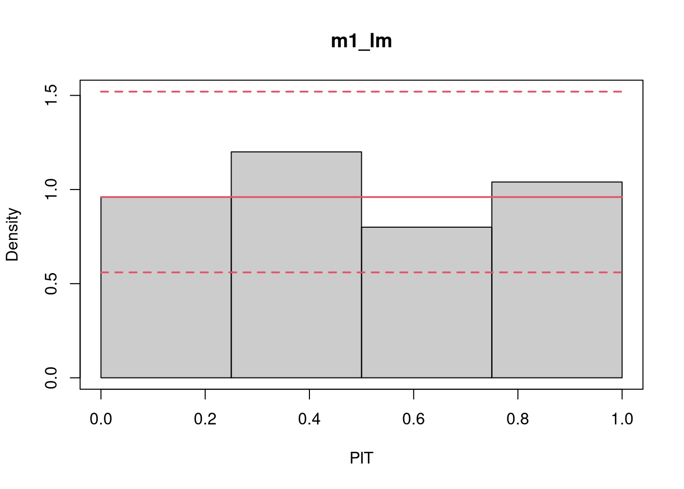
library("topmodels")## speed and stopping distances of carsm1_lm<-lm(dist~speed, data =cars)## compute and plot pithistpithist(m1_lm)
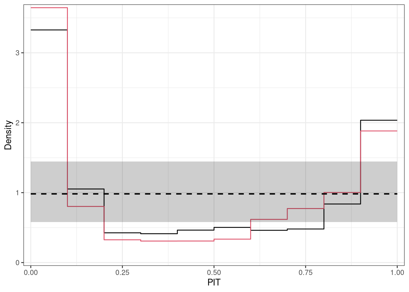
#-------------------------------------------------------------------------------## determinants for male satellites to nesting horseshoe crabsdata("CrabSatellites", package ="countreg")## linear poisson modelm1_pois<-glm(satellites~width+color, data =CrabSatellites, family =poisson)m2_pois<-glm(satellites~color, data =CrabSatellites, family =poisson)## compute and plot pithist as base graphicp1<-pithist(m1_pois, plot =FALSE)p2<-pithist(m2_pois, plot =FALSE)## plot combined pithist as "ggplot2" graphicggplot2::autoplot(c(p1, p2), single_graph =TRUE, style ="line", col =c(1, 2))