Graphical Evaluation: Methodology
Moritz Lang, Achim Zeileis
graphical_evaluation_methodology.RmdIntroduction
Before discussing the various graphical evaluation methods in more detail, we want to outline the underlying motivation and identify similarities and differences in the methodologies. According to the seminal work of Gneiting, Balabdaoui, and Raftery (2007), probabilistic forecasts aim to maximize the sharpness of the predictive distributions subject to calibration. Calibration here refers to the statistical concordance between the forecast and the observation, and is thus a joint property of the forecast and observation. Sharpness, on the other hand, is a property of the forecast only and indicates how concentrated a predictive distribution is. In general, the more concentrated the sharper the forecast.
In this article, we focus on several graphical diagnostic tools to assess the calibration of a probabilistic forecast \(F( \cdot | \boldsymbol{\theta}_{i})\), issued in form of a predictive distribution \(f( \cdot | \boldsymbol{\theta}_{i})\). Given observations \(y_i (i = 1, \ldots, n)\), we assume a set of observation-specific fitted parameters \(\hat{\boldsymbol{\theta}}_{i} = (\hat{\theta}_{i1}, \ldots, \hat{\theta}_{iK})^\top\), where the estimation may have been performed on the same observations \(i = 1, \ldots, n\) (i.e., corresponding to an in-sample assessment) or on a different data set (i.e., corresponding to an out-of-sample evaluation). The estimation procedure itself can be either fully parametric or semi-parametric, as long as fitted parameters \(\hat{\boldsymbol{\theta}}_{i}\) exist for all observations of interest. However, since the uncertainty in the estimation of the parameters is not accounted for, small deviations from asymptotic theoretical properties will be apparent in all graphical displays due to some sampling variation.
Probabilistic calibration: PIT residuals
According to Gneiting, Balabdaoui, and Raftery (2007), model calibration can be further distinguished between probabilistic calibration and marginal calibration. Probabilistic calibration is usually assessed using probability integral transform (PIT) values (Dawid 1984; Diebold, Gunther, and Tay 1998; Gneiting, Balabdaoui, and Raftery 2007) or so-called PIT residuals (Warton 2017). These are simply the predictive cumulative distribution function (CDF) evaluated at the observations
\[u_i = F(y_i | \, \hat{\boldsymbol{\theta}}_i),\]
where \(F( \cdot )\) denotes the CDF of the modeled distribution \(f( \cdot )\) with estimated parameters \(\hat{\boldsymbol{\theta}}_{i}\). PIT residuals have the desirable property, that if the model is a good approximation to the true data-generating process, i.e., the observation is drawn from the predictive distribution, the PIT residuals \(u_i\) are approximately uniformly distributed on \([0, 1]\) for continous predictive distributions \(F( \cdot )\). PIT residuals or variants have therefore been used extensively for model diagnosis and depending on their implementation are known under various names, among them forecast distribution transformed residuals (Smith 1985), randomized quantile residuals (Dunn and Smyth 1996), and universal residuals (Brockwell 2007).
In case of a discrete predictive distribution or a distribution with a discrete component, e.g., in case of censoring, \(u_i\) can be generated as a random draw \(\text{U}\) from the interval:
\[u_i = \text{U}[F(y_i - 1 | \, \hat{\boldsymbol{\theta}}_i), F(y_i | \, \hat{\boldsymbol{\theta}}_i)].\]
Here, we follow the definition by Dunn and Smyth (1996), but similar approaches have also been proposed in, e.g., Brockwell (2007) and Smith (1985). Again \(u_i\) is uniformally distributed, apart from sampling variability.
Since the PIT residuals are an iid sample from the standard uniform distribution, the PIT residuals can also be mapped to other distribution scales, e.g. to the standard normal scale, and should follow a standard normal distribution here. In the simplest case, the PIT residuals \(u_i\) can be plotted against the probabilities of a uniform distribution in so-called P-P plots (Wilk and Gnanadesikan 1968; Handcock and Morris 1999). However, it is far more common to transform the PIT residuals to the normal scale and compare them to the standard normal quantiles in a normal Q-Q plot (Hoaglin 2006). Alternatively, in a PIT histogram, the uniformally distributed PIT residuals are divided into intervals by a certain number of breakpoints and plotted in a histogram-style plot. Regardless of the graphical display, the PIT residuals are always on the probability scale, which might be transformed to the normal scale or another scale if preferred.
Marginal calibration: Observed vs. expected frequencies
Marginal calibration is generally concerned with whether the oberseved frequencies match the frequencies expected by the model. For discrete observations, frequencies for the observations themselves can be considered; for continuous observations or more generally, frequencies for intevals of observations are being used. Here, the expected frequencies are computed by differences between the predictive CDFs \(F( \cdot )\), evaluated at the interval breaks. Hence, mariginal calibration is always obtained on the observation scale compared to the probabilistic calibration performed on the probability scale. Although there are some previous studies that display observation points rather than intervals (e.g., Gneiting, Balabdaoui, and Raftery 2007), here we stick to the former and discuss only the so-called rootograms which are histogram-style plots (Kleiber and Zeileis 2016).
For the special case of a binary event, the observed event frequency is typically plotted against the predictive probability in a so-called reliability diagram (Wilks 2011; Bröcker and Smith 2007). Here, the predicted probability for a binary event is partitioned into a certain number of bins and the averaged forecast probability within each bin is plotted against the observerd relative frequency. Typically, equidistant binning is employed, but here the rather arbitrary number of bins can be quite sensible. A simple and common enhancement is therefore to use evenly populated bins, though even here instabilities can be a major issue (Dimitriadis, Gneiting, and Jordan 2021).
Similarities and differences
In the graphical displays for assessing the goodness of fit, several recurring elements can be seen:
PIT residuals are asymptotically uniformly distributed or transformed to another probability scale: The PIT histogram is on the uniform probability scale versus the normal Q-Q plot on the normal scale. Whereas, the transformation to the normal scale spreads the values in the tails further apart and thus better highlights possible discrepancies in the distribuional tails.
The marginal calibration is usually evaluated on the observation scale by checking whether observed and expected frequencies match. The rootogram, on the observation scale, is therefore especially useful for count data with values close to zero.
Discretization: Instead of plotting the raw values, e.g. PIT residuals, often some discretization improves readability of the graphical displays. The disadvantage here is that the breakpoint are often kind of arbitrary and certain misspecification might therefore be masked by plotting the values as intervals. For example, misscpecifications in the outer tails of the distribution are often not visible in PIT histograms, as the intervals are averaving over many data points; here, Q-Q plots are clearly superior. Another example is the reliabitiliy diagram, which can be quite instable when using equidistant binning.
The uncertainty due to the estimation of the parameters is not taken into account. Therefore, some sampling variation is seen in all graphical displays.
Methodology
Rootogram
The rootogram is a graphical tool for assessing the goodness of fit in terms of mariginal calibration of a parametric univariate distributional model, with estimated parameters \(\hat{\boldsymbol{\theta}}_{i} = (\hat{\theta}_{i1}, \ldots, \hat{\theta}_{iK})^\top\) and \(f( \cdot )\) desribing the density or probability mass function. Rootograms evaluate graphically whether observed frequencies \(\text{obs}_j\) match the expected frequencies \(\text{exp}_j\) by plotting histogram-like rectangles or bars for the observed frequencies and a curve for the fitted frequencies, both on a square-root scale. In the form presented here, it was implemented by Kleiber and Zeileis (2016) building on work of Tukey (1977).
In the most general form, given an observational vector of a random variable \(y_i (i = 1, \ldots, n)\) which is divided into subsets by a set of breakpoints \(b_0, b_1, b_2, \dots~\), the observed and expected frequencies are given by
\[\text{obs}_j = \sum_{i=1}^{n}w_{i} I(y_i \in (b_j, b_{j+1}]),\] \[\text{exp}_j = \sum_{i=1}^{n}w\{F(b_{j+1} | \hat{\boldsymbol{\theta}}_{i}) - F(b_{j} | \hat{\boldsymbol{\theta}}_{i})\},\]
with \(F( \cdot )\) being the CDF of the modeled distributional model \(f( \cdot )\) and \(w_i\) being optional observation-specific weights. Whereby, the weights are typically needed either for survey data or for situations with model-based weights (Kleiber and Zeileis 2016).
For a discrete variable \(y_i\), the observed and expected frequencies can be simplified and are given for each integer \(j\) by
\[\text{obs}_j = \sum_{i=1}^{n}I(y_i - j),\] \[\text{exp}_j = \sum_{i=1}^{n}f(j | \hat{\boldsymbol{\theta}}_{i}),\]
with the indicator variable \(I( \cdot )\) (Kleiber and Zeileis 2016). As rootograms are best known for count data, the latter form is quite common.
Different styles of rootograms have been proposed and are extensively discussed in Kleiber and Zeileis (2016). As default, they propose a so called “hanging” rootogram, which aligns all deviations along the horizontal axis, as the rectangles are drawn from \(\sqrt{exp_j}\) to \(\sqrt{exp_j} - \sqrt{obs_j}\), so that they “hang” from the curve with the expected frequencies \(\sqrt{exp_j}\).
The concept of comparing observed and expected frequencies graphically was also introduced in the seminal work on assessing calibration and sharpness for a predictive probalilty model by Gneiting, Balabdaoui, and Raftery (2007) and, building on this, applied to count data by Czado, Gneiting, and Held (2009). However, since in both cases either the deviations or the expected and observed frequencies are presented only as lines connecting the respective frequencies, deviations are more difficult to detect compared to the rootograms introduced by Tukey (1977) and further enhanced by Kleiber and Zeileis (2016).
PIT Histogram
As described in the introduction, to check for probabilistic calibration of a regression model, Dawid (1984) proposed the use of the probability integral transform (PIT) which is simply the predictive cumulative distribution function (CDF) evaluated at the observations. PIT values have been used under various names (e.g., Smith 1985; Dunn and Smyth 1996; Brockwell 2007) , to emphasize their similar properties to residuals we follow Warton (2017) and refer to them as PIT residuals from now on.
For a continuous random variable \(y_i (i = 1, \ldots, n)\), PIT residuals are defined as
\[u_i = F(y_i | \, \hat{\boldsymbol{\theta}}_i)\]
where \(F( \cdot )\) denotes the CDF of the modeled distribution \(f( \cdot )\) with estimated parameters \(\hat{\boldsymbol{\theta}}_{i} = (\hat{\theta}_{i1}, \ldots, \hat{\theta}_{iK})^\top\). If the estimated model is a good approximation to the true data generating process, the observation will be drawn from the predictive distribution and the PIT residuals \(u_i\) are approximately uniformly distributed on \([0, 1]\). Plotting the histogram of the PIT residuals and checking for uniformity is therefore a common empirical way of checking for calibration (Diebold, Gunther, and Tay 1998; Gneiting, Balabdaoui, and Raftery 2007). Whereas, deviations from uniformity point to underlying forecast errors and model deficiencies: U-shaped histograms refer to underdispersed predictive distributions, inverted U-shaped histograms to overdispersion, and skewed histograms suggest that central tendencies must be biased (Gneiting, Balabdaoui, and Raftery 2007; Czado, Gneiting, and Held 2009).
When considering discrete response distributions or distributions with a discrete component, e.g., in case of censoring, for a random discrete variable \(y_i\) the PIT \(u_i\) can be generated as a random draw from the interval \([F(y_i - 1 | \, \hat{\boldsymbol{\theta}}_i), F(y_i | \, \hat{\boldsymbol{\theta}}_i)]\). Even if this leads to some randomness in the graphical representation of PIT residuals, for cases with a high number of observations the impact on the graphical evaluation when repeating the calculations (i.e. drawing new values \(u_i\)) is typically rather small. For small data sets, we recommend to increase the number of random draws which significantly reduces the randomness in the graphical display.
Alternatively, a nonrandom PIT histogram was introduced by Czado, Gneiting, and Held (2009), where rather than building on randomized pointwise PIT resdiuals \(u_i\) the expected fraction of the CDF along the interval \([F(y_i - 1 | \, \hat{\boldsymbol{\theta}}_i), F(y_i | \, \hat{\boldsymbol{\theta}}_i)]\) is used. This is asympotically equivalent to drawing an infinite number of random PIT residuals.
Q-Q Residuals Plot
Quantile residuals are simply the inverse cumulative distribution function of a standard normal distribution \(\Phi^{-1}\) evaluated at the PIT residuals \(u_i (i = 1, \ldots, n)\), hence, they can be defined as
\[\hat{r}_i = \Phi^{-1}(F(y_i | \, \hat{\boldsymbol{\theta}}_{i})) = \Phi^{-1}(u_i),\]
where \(F( \cdot )\) again denotes the cumulative distribution function (CDF) of the modeled distribution \(f( \cdot )\) with estimated parameters \(\hat{\boldsymbol{\theta}}_{i} = (\hat{\theta}_{i1}, \ldots, \hat{\theta}_{iK})^\top\) (Dunn and Smyth 1996). As before, for discrete or partly discrete responses, the approach includes some randomization to achieve continuous \(u_i\) values; quantile residuals are therefore often referred to as randomized quantile residuals in the literature (Dunn and Smyth 1996).
In case of a correct model fit, the values \(u_i\) are uniformly distributed on the unit interval and the Q-Q residuals should at least approximately be standard normally distributed. Hence, to check for normality, quantile residuals can be graphically compared to theoretical quantiles of the standard normal distribution, where strong deviations from the bisecting line indicate a misspecified model fit.
Mathematically, Q-Q plot consists of the tuples
\[(z_{(1)}, \hat{r}_{(1)}), \ldots, (z_{(n)}, \hat{r}_{(n)}),\]
where \(\hat{r}_{(i)}\) denotes the \(i\)th order statistic of the quantile residuals, so that \(\hat{r}_{(1)} \leq \hat{r}_{(2)} \cdot \leq \hat{r}_{(n)}\), and \(z_{(i)}\) is the ordered statistics from the respective standard normal quantiles \(\Phi^{-1}( p_i)\), evaluated at the cumulative proportion \(p_i = (i - 0.5) / n\) for \(n\) greater \(10\). This graphical evaluation is well known as normal probability plot or normal Q-Q plot (Hoaglin 2006). Due to the transformation of the PIT residuals \(u_i\) to the normal scale, their extreme values are more widely spread, so that normal Q-Q diagrams are better suited than, for example, PIT histograms to detect violations of the distribution assumption within its tails. An additional possible advantage of Q-Q plots is that they avoid the necessity of defining breakpoints as typically needed for histogram style evaluations (Klein et al. 2015).
But Q-Q plots can also be applied to check if residuals follow any other known distribution, by employing any other inverse cumulative distribution function of interest instead of \(\Phi^{-1}\) in the computation and comparing the quantile residuals \(\hat{r}_i\) to the respective theoretical quantiles. This is called than a theoretical quantile-quantile plot or Q-Q plot for short (Friendly 1991).
Worm plot
As in Q-Q plots, small too medium deviations can be quite hard to detect, untilting the plot by subtracting the theoretical quantiles, makes detecting pattern of departure from a now horizontal line much easier. Mathematically, therefore, the tuples in the plot are
\[(z_{(1)}, \hat{r}_{(1)} - z_{(1)}), \ldots, (z_{(n)}, \hat{r}_{(n)} - z_{(n)}),\]
where as before, where \(\hat{r}_{(i)}\) denotes the order statistic of the empirical quantile residuals and \(z_{(i)}\) the ordered statistics of the respective standard normal quantiles. This so-called de-trended Q-Q plot (Friendly 1991) is best known by the application of Buuren and Fredriks (2001), and is therefore usually referred to as worm plot according to their naming.
Summary plot
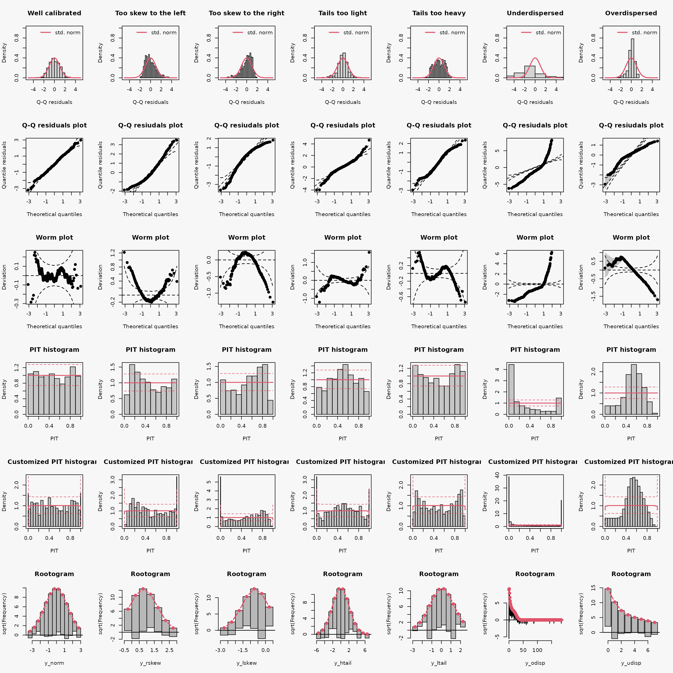
| Predictive distribution | well calibrated | too skew to the left | too skew to the right | tails too light | tails too heavy | underdispersed (underestimated variance) | overdispersed (overestimated variance) |
|---|---|---|---|---|---|---|---|
| Resdiuals | normal | right skewed | left skewed | heavy tailed | light tailed | overdispersed | underdispersed |
| Q-Q plot | bisecting line | positive curvature (bends up the line at both ends) | negative curvature (bends down at both ends) | reverse S-shape (dips below the line at the low end and rises above it at the high end) | S-shape | crossing qqline from below (?) | crossing qqline from above ? |
| Worm plot | horizontal line | U-shape | inverse U-shape | S-shape on the left bent down | S-shape on the left bent up | positive slope | negative slope |
| PIT histogram | uniform | skewed | skewed | superimposed U-shape | superimposed inverse U-shape" | U-shape | inverse U-shape |
| Rootogram | no deviations | ? | ? | wave-like (underfitting in the tails and the center) | ? | ? | ? |
| Interpretation | no misspecifications | ? | ? | values more extrem as expected | values less extrem as expected | ? | ? |
References
Bröcker, Jochen, and Leonard A. Smith. 2007. “Increasing the Reliability of Reliability Diagrams.” Weather and Forecasting 22 (3): 651–61. https://doi.org/10.1175/WAF993.1.
Brockwell, A.E. 2007. “Universal Residuals: A Multivariate Transformation.” Statistics & Probability Letters 77 (14): 1473–8. https://doi.org/https://doi.org/10.1016/j.spl.2007.02.008.
Buuren, Stef van, and Miranda Fredriks. 2001. “Worm Plot: A Simple Diagnostic Device for Modelling Growth Reference Curves.” Statistics in Medicine 20 (8): 1259–77. https://doi.org/10.1002/sim.746.
Czado, Claudia, Tilmann Gneiting, and Leonhard Held. 2009. “Predictive Model Assessment for Count Data.” Biometrics 65 (4): 1254–61. https://doi.org/10.1111/j.1541-0420.2009.01191.x.
Dawid, A. P. 1984. “Present Position and Potential Developments: Some Personal Views: Statistical Theory: The Prequential Approach.” Journal of the Royal Statistical Society: Series A (General) 147 (2): 278–92. https://doi.org/10.2307/2981683.
Diebold, Francis X., Todd A. Gunther, and Anthony S. Tay. 1998. “Evaluating Density Forecasts with Applications to Financial Risk Management.” International Economic Review 39 (4): 863–83. https://doi.org/10.2307/2527342.
Dimitriadis, Timo, Tilmann Gneiting, and Alexander I. Jordan. 2021. “Stable Reliability Diagrams for Probabilistic Classifiers.” Proceedings of the National Academy of Sciences 118 (8). https://doi.org/10.1073/pnas.2016191118.
Dunn, Peter K., and Gordon K. Smyth. 1996. “Randomized Quantile Residuals.” Journal of Computational and Graphical Statistics 5 (3): 236–44. https://doi.org/10.2307/1390802.
Friendly, Michael. 1991. SAS System for Statistical Graphics. 1st ed. Cary, NC: SAS Institute Inc.
Gneiting, Tilmann, Fadoua Balabdaoui, and Adrian E. Raftery. 2007. “Probabilistic Forecasts, Calibration and Sharpness.” Journal of the Royal Statistical Society: Series B (Methodological) 69 (2): 243–68. https://doi.org/10.1111/j.1467-9868.2007.00587.x.
Handcock, Mark S., and Martina Morris. 1999. Relative Distribution Methods in the Social Sciences. New York: Springer. http://www.stat.ucla.edu/~handcock/RelDist.
Hoaglin, David C. 2006. “Using Quantiles to Study Shape.” In Exploring Data Tables, Trends, and Shapes, 417–60. John Wiley & Sons, Ltd. https://doi.org/https://doi.org/10.1002/9781118150702.ch10.
Kleiber, Christian, and Achim Zeileis. 2016. “Visualizing Count Data Regressions Using Rootograms.” The American Statistician 70 (3): 296–303. https://doi.org/10.1080/00031305.2016.1173590.
Klein, Nadja, Thomas Kneib, Stefan Lang, and Alexander Sohn. 2015. “Bayesian Structured Additive Distributional Regression with an Application to Regional Income Inequality in Germany.” Annals of Applied Statistics 9: 1024–52. https://doi.org/10.1214/15-aoas823.
Smith, J. Q. 1985. “Diagnostic Checks of Non-Standard Time Series Models.” Journal of Forecasting 4 (3): 283–91. https://doi.org/https://doi.org/10.1002/for.3980040305.
Tukey, John W. 1977. Exploratory Data Analysis. Addison-Wesley.
Warton, Loïc AND Wang, David I. AND Thibaut. 2017. “The Pit-Trap—a ‘Model-Free’ Bootstrap Procedure for Inference About Regression Models with Discrete, Multivariate Responses.” PLOS ONE 12 (7): 1–18. https://doi.org/10.1371/journal.pone.0181790.
Wilk, M. B., and R. Gnanadesikan. 1968. “Probability Plotting Methods for the Analysis of Data.” Biometrika 55 (1): 1–17.
Wilks, Daniel. 2011. Statistical Methods in the Atmospheric Sciences. 3rd ed. Academic Press.